Flexbox Gotchas Reloaded

Important: this article describes a problem that cannot be reproduced with Google Chrome, only with Firefox and Edge (I did not test with other browsers). Spoiler alert: it seems like Chrome intentionally deviates from the spec standard.
Intro
Despite of all the jokes saying it is not even a real programming language, more that 20 years since its creation, CSS is still one of the most misunderstood web technologies.
While it allows us to describe complex layouts in a high-level fashion, sometimes we bump into issues with corner cases. Also the CSS spec is not getting any smaller with time, and while I certainly do not miss juggling around with float and clear, it is hard to deny that flexbox and grid brought a lot of complexity to CSS.
TL;DR
I stumbled upon an issue with flexbox and white-space: nowrap, causing a flex child width to be larger than its parents. Visit this codesandbox to view the solution.
Flexbox all the things

I must admit that I might be overusing flexbox, but the reality is that other methods for centering content both vertically and horizontally are way too hacky.
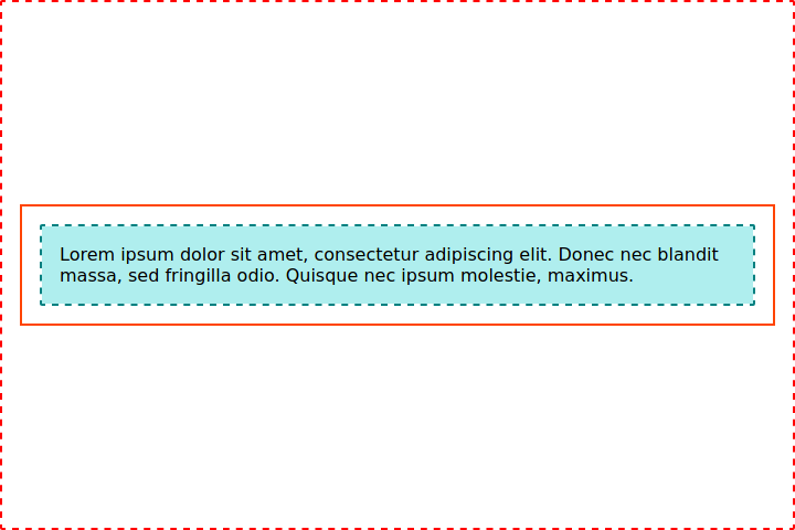
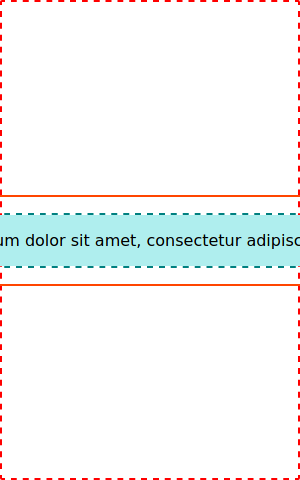
I had this screen from the app I am currently working on whose outer-most wrapper was a flex container. The screen is supposed to be responsive, so there was no limits for its width. Deeply nested into the HTML tree there is another flex container whose children contained text that could potentially spread across multiple lines.
I was able to create a minimum reproducible example, so please forgive me if it looks a bit contrived.
Here is the markup:
<div class="outer-flex-container">
  <div class="outer-flex-child">
    <div class="inner-flex-container">
      <div class="inner-flex-child">
        Lorem ipsum dolor sit amet, consectetur adipiscing elit. Donec nec
        blandit massa, sed fringilla odio. Quisque nec ipsum molestie,
        maximus.
      </div>
    </div>
  </div>
</div>
And here are the styles:
.outer-flex-container {
  border: 2px dashed red;
  display: flex;
  justify-content: center;
  align-items: center;
  height: 100vh;
  padding: 16px;
}

.outer-flex-child {
  border: 2px solid orangered;
  padding: 16px;
}

.inner-flex-container {
  border: 2px dashed teal;
  display: flex;
  justify-content: center;
}

.inner-flex-child {
  background: paleturquoise;
  padding: 16px;
}
The result:
The issue
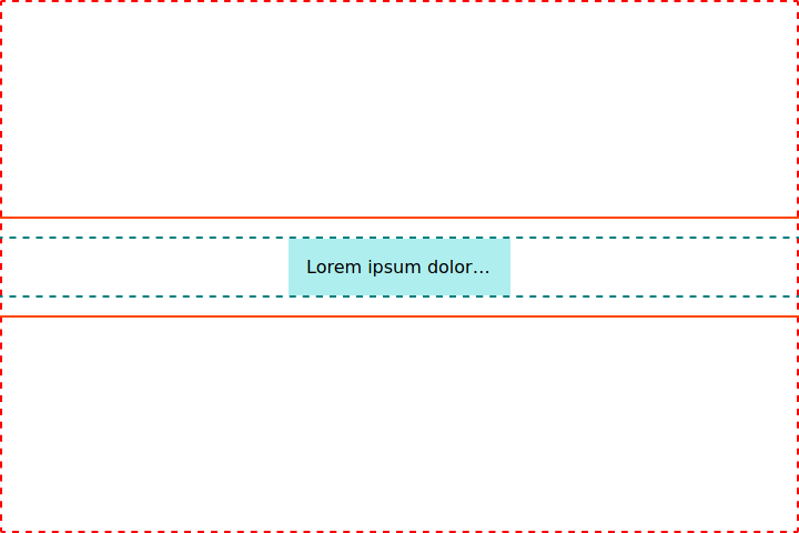
Because of layout constraints, I need the text in .inner-flex-child to be displayed in a single line, so I happily went along with:
 .inner-flex-child {
   background: paleturquoise;
   padding: 16px;
+  overflow: hidden;
+  text-overflow: ellipsis;
+  white-space: nowrap;
 }
The result however surprised me:
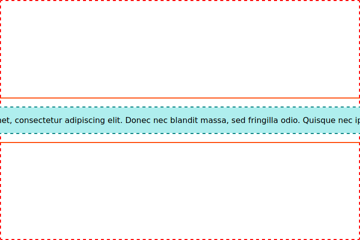
Oddly the .inner-flex-child now stopped respecting its parent's width. Furthermore, it seems like it is forcing both .inner-flex-container and .outer-flex.child to overflow .outer-flex-container width.
Okay, let's just:
 .inner-flex-child {
   background: paleturquoise;
   padding: 16px;
   overflow: hidden;
   text-overflow: ellipsis;
   white-space: nowrap;
+  width: 100%;
 }
And that will do it!
Nop! That did not work at all. Results were still the same. I tried then every possible combination of width, max-width, min-width, flex-basis I could think of without success.
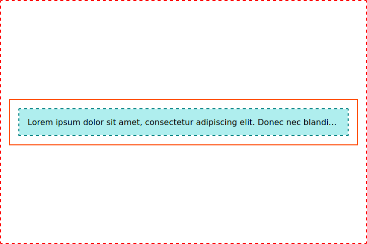
For example, if I set a fixed width for .inner-flex-child:
 .inner-flex-child {
   background: paleturquoise;
   padding: 16px;
   overflow: hidden;
   text-overflow: ellipsis;
   white-space: nowrap;
+  width: 500px;
 }
I would get:
Works as expected if the viewport is larger than 500px, but expectedly if I had a smaller screen, the problem would be back:
Switching width to max-width however did not do the trick.
Another attempt had me setting flex-basis, flex-grow and flex-shrink:
 .inner-flex-child {
   background: paleturquoise;
   padding: 16px;
   overflow: hidden;
   text-overflow: ellipsis;
   white-space: nowrap;
+  flex: 200px 0 1;
 }
The idea here was to set the flex-basis to a fixed width, do not allow .inner-flex-child to grow, but do allow it to shrink. However, the result was even weirder:
Even though the content size was respecting the 200px I set, .inner-flex-container was still overflowing its parents. My head was now a complete mess.
Halt! DuckDuckGo time
Defeated, I resorted to the knowledge of the world wide web. I started digging with DuckDuckGo (just like Google, but it respects your privacy) and found this example. Apparently setting min-width: 0; in .inner-flex-child was supposed to do the trick:
 .inner-flex-child {
   background: paleturquoise;
   padding: 16px;
   overflow: hidden;
   text-overflow: ellipsis;
   white-space: nowrap;
+  min-width: 0;
 }
But it did not! I was bummed out at first, but I kept on digging. Of course there was something regarding that in StackOverflow. However the solution pointed to the same min-width: 0 trick. I was almost dismissing it when I saw it had a link to the spec.
The linked spec session starts with:
Note: The
autokeyword, representing an automatic minimum size, is the new initial value of themin-widthandmin-heightproperties. The keyword was previously defined in this specification, but is now defined in the CSS Sizing module.
From that I understood that flex children have the value of min-width and min-height default to auto if not specified.
Then it goes on:
To provide a more reasonable default minimum size for flex items, the used value of a main axis automatic minimum size on a flex item that is not a scroll container is a content-based minimum size; for scroll containers the automatic minimum size is zero, as usual.
That's a mouthful. I was in rush/lazy mode by the time I was reading this, so I gave up. This is a behavioral pattern I fallback into when I am tired and with enough training I learnt how to recognize this and went out — of the room, since I am writing this in the middle of the Covid-19 pandemic, I could not leave the apartment — for a while.
After a cup of coffee and trying to put myself in the right mental state, I went back to the same SO question. It actually does a good job "translating" the spec into something more digestible:
With regard to the auto value...
On a flex item whose overflow is visible in the main axis, when specified on the flex item’s main-axis min-size property, specifies an automatic minimum size. It otherwise computes to 0.
In other words:
- The min-width: auto and min-height: auto defaults apply only when overflow is visible.
- If the overflow value is not visible, the value of the min-size property is 0.
- Hence, overflow: hidden can be a substitute for min-width: 0 and min-height: 0.
But here is the problem: .inner-flex-child is already a flex container, because it has overflow: hidden set. Damn you, CSS!
Reading on, I reached this section:
You've applied min-width: 0 and the item still doesn't shrink?
Nested Flex Containers
If you're dealing with flex items on multiple levels of the HTML structure, it may be necessary to override the default min-width: auto / min-height: auto on items at higher levels.
Basically, a higher level flex item with min-width: auto can prevent shrinking on items nested below with min-width: 0.
That was exactly the problem I was facing. I was only meddling with .inner-flex-child and .inner-flex-container the whole time. However, I had more flex content above in the DOM hierarchy. Dumbass!
So I tried the following:
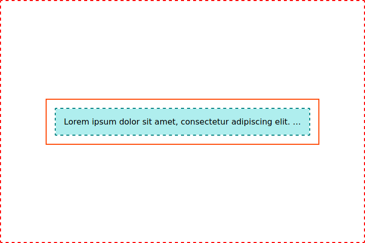
 .outer-flex-child {
   border: 2px solid orangered;
   padding: 16px;
+  min-width: 0;
 }
Aaaaaand bingo!
I decided to play around with the working example and found out that the following approaches have the same effect:
 .outer-flex-child {
   border: 2px solid orangered;
   padding: 16px;
+ overflow: hidden;
 }
According to the spec, this fixes the issue because .outer-flex-child is now a scroll container, so min-width default value falls-back to 0. The downside of this is that if it contained any children that might be out of bounds — such as a tooltip or a modal with position: absolute — they would be clipped out.
 .outer-flex-child {
   border: 2px solid orangered;
   padding: 16px;
+  max-width: 100%;
 }
While not directly mentioned in the linked spec section, I noticed that .outer-flex-container width itself was not affected by the overflowing content. When using % as unit, it will be always relative to the parent's dimensions, so setting max-width: 100% does the trick as well, at least in this specific case.
Here is a codesandbox with the example I used throughout this article and the possible solutions.
That's all folks!